Snippets
Common patterns for building sites and apps that build on existing components and utilities with custom CSS and more.
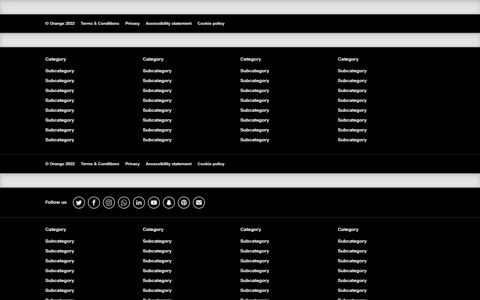
Footers
Finish every page strong with an awesome footer, big or small.
Custom Components
Brand-new components and templates to help folks quickly get started with Boosted and demonstrate best practices for adding onto the framework.
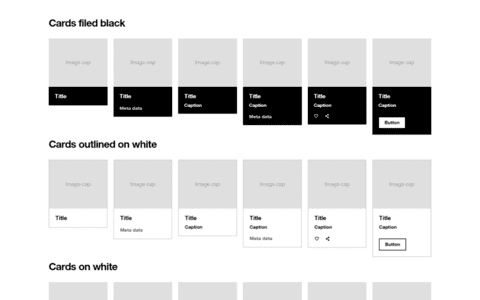
Cards
List of all card variants (content and design).
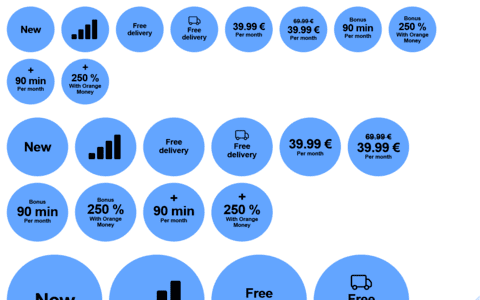
Stickers
List of all sticker variants.

Tags
Some tags use cases from links to filter.
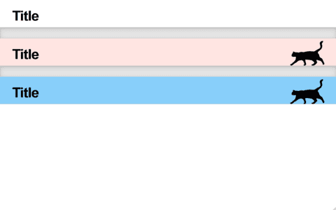
Title bars
Innovation Cup branded title bars to introduce titles.
Framework
Examples that focus on implementing uses of built-in components provided by Boosted.
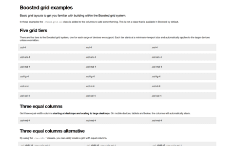
Grid
Multiple examples of grid layouts with all four tiers, nesting, and more.
Navbars
Taking the default navbar component and showing how it can be moved, placed, and extended.
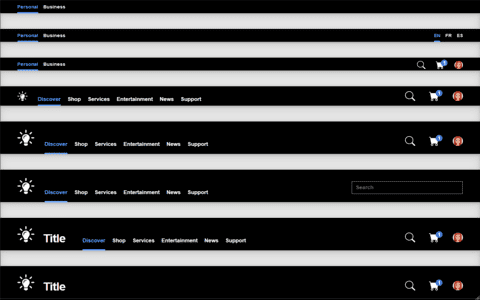
Navbars
Demonstration of all responsive and container options for the navbar.
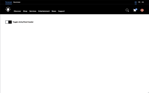
Navbar sticky
Single navbar example of a sticky-top navbar along with some additional content.
Integrations
Integrations with external libraries.
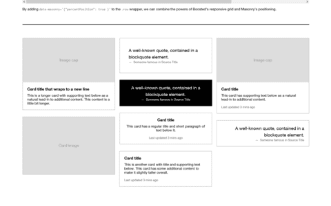
Masonry
Combine the powers of the Boosted grid and the Masonry layout.