A new Orange Unified Design System is being developed. Explore OUDS Web
Orange brand guidelines
Have a need for Boosted’s brand resources? We have a few guidelines we follow, and in turn ask you to follow as well.
These guidelines were published by Orange SA Orange Brand Assets.
Orange logo
The Orange logo is the strongest association people have with the brand, so we have to use it correctly.
Our logo is made up of the orange block, the logotype and the TM sign. When using the Orange logo never try to recreate it. Instead, download our original logo artwork and make sure you follow our top rules:
- The Master logo is a bespoke design — always use original artwork.
- The Master logo sits on the grid and (in most cases) is positioned in one of the corners.
- The Small logo is used for minimum size work and has animated behaviours.
To find out how you can use our mark to make yours, read the core guideline.
Master artwork
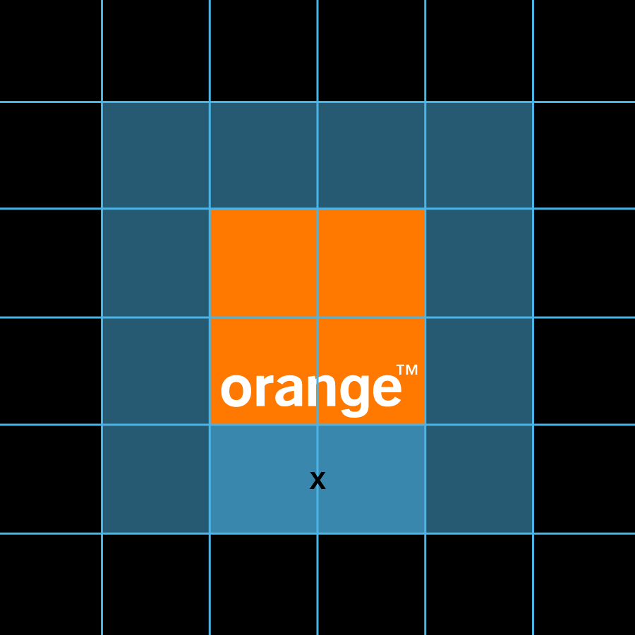
The basic elements of the Master logo are the square and the word mark Orange™.
Together they make up the Master logo, a trademark that is legally registered and protected.
These elements must never be altered in any way and the Master logo must always be applied using original artwork. The word mark never appears outside of the square. Always write our brand name with a leading cap (Orange) in all other cases. To protect its integrity, the Master logo may not be altered, distorted or animated in any way.
Clear space
The Master logo should always have clear space around it to protect it from other graphic elements and help it stand out.
Always aim to set the clear space to 0.5×. Where the space is limited (e.g. web) or when you
need maximum visibility (e.g. perimeter boards), set your clear space to 0.25× instead.
To maintain clarity and legibility, we have set minimum sizes for the Master logo.
Minimum sizes
| Digital | |||
|---|---|---|---|
| Media | Mobile | Tablet & desktop | |
| Size (×) | 10mm | 30px | 50px |
| Preferred clear space (0.5×) | 5mm | 15px | 25px |
| Small clear space (0.25×) | 2.5mm | 7.5px | 12.5px |
Small logo
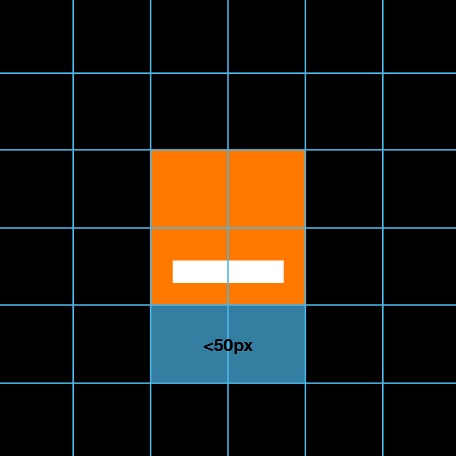
The Small logo is used for minimum size work when the Master logo is no longer clearly visible.
- The Small logo is used when the size of the Master logo appears less than
50pxon desktops or tablet screens,30pxon mobile screens and10mmin printed media or product branding. - The clear space area around the Small logo is equal to
0.25×. - The basic elements of the Small logo are the square and a line with solid white fill. Together they make up the Small logo.
- The Small logo follows the same colourways as the Master logo.
These elements must never be altered in any way and must always be applied using original artwork. It’s possible to animate the Small logo; however this process is strictly managed by the Global brand team. Apply the Small logo correctly by avoiding the following:
- Never change the color of the line, even in animation.
- The line always has a solid, white fill. It is never transparent.
- Never use the trademark symbol.
- Never change the size of the line - it allows optimal readability in small sizes and represents the name “Orange” from the Master logo.
- Never change the colourways of the Small logo.
Color palette
This is Orange Web UI color palette, as specified in Orange Web UI Kits.
Please refer to the accessibility’s
color contrast section before trying using this, in order to ensure sufficient contrasts,
and prefer using .text-* and .bg-*
utilities to set colors, since they lock color and background-color altogether
to ensure sufficient contrasts.
Core Colors
#fff
#000
#ff7900
#f16e00
Functionnal Colors
#32c832
#527edb
#fc0
#cd3c14
Supporting Colors
#4bb4e6
#ffd200
#50be87
#a885d8
#ffb4e6
Greys
#fafafa
#f6f6f6
#eee
#ddd
#ccc
#999
#666
#595959
#333
Bootstrap brand guidelines
Boosted is based on Bootstrap, which has its own logo and brand usage guidelines.