New in v5.3 Color mode support, expanded color palette, and more!

Orange Boosted
with Bootstrap

Powerful, extensible, and feature-packed frontend toolkit. Build and customize with Sass, utilize prebuilt grid system and components, and bring projects to life with powerful JavaScript plugins.

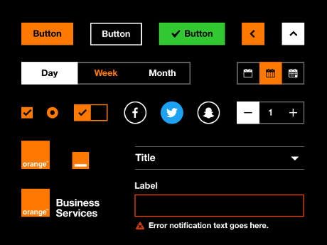
Orange Boosted is a Bootstrap based, Orange branded accessible and ergonomic components library.

npm i boosted@5.3.3
Read the docs

Currently v5.3.3 · Download · All releases

Get started any way you want

Jump right into building with Boosted—use the CDN, install it via package manager, or download the source code.

Read installation docs

Install via package manager

Install Boosted’s source Sass and JavaScript files via npm, yarn, Composer, or NuGet. Package managed installs don’t include documentation or our full build scripts.

npm install boosted@5.3.3
yarn add boosted@5.3.3

Read our installation docs for more info and additional package managers.

Include via CDN

When you only need to include Boosted’s compiled CSS or JS, you can use jsDelivr. See it in action with our simple quick start, or browse the examples to jumpstart your next project. You can also choose to include Popper and our JS separately.

<link href="https://cdn.jsdelivr.net/npm/boosted@5.3.3/dist/css/boosted.min.css" rel="stylesheet" integrity="sha384-laZ3JUZ5Ln2YqhfBvadDpNyBo7w5qmWaRnnXuRwNhJeTEFuSdGbzl4ZGHAEnTozR" crossorigin="anonymous">
<script src="https://cdn.jsdelivr.net/npm/boosted@5.3.3/dist/js/boosted.bundle.min.js" integrity="sha384-3RoJImQ+Yz4jAyP6xW29kJhqJOE3rdjuu9wkNycjCuDnGAtC/crm79mLcwj1w2o/" crossorigin="anonymous"></script>

Read our getting started guides

Get a jump on including Boosted's source files in a new project with our official guides.

Customize everything with Sass

Boosted utilizes Sass for a modular and customizable architecture. Import only the components you need, enable global options like gradients and shadows, and write your own CSS with our variables, maps, functions, and mixins.

Learn more about customizing

Include all of Boosted’s Sass

Import one stylesheet and you're off to the races with every feature of our CSS.

// Variable overrides first
$primary: #900;
$enable-shadows: true;
$prefix: "mo-";

// Then import Boosted
@import "../node_modules/boosted/scss/boosted";

Learn more about our global Sass options.

Include what you need

The easiest way to customize Boosted—include only the CSS you need.

// Functions first
@import "../node_modules/boosted/scss/functions";

// Variable overrides second
$primary: #900;
$enable-shadows: true;
$prefix: "mo-";

// Required Boosted imports
@import "../node_modules/boosted/scss/variables";
@import "../node_modules/boosted/scss/variables-dark";
@import "../node_modules/boosted/scss/maps";
@import "../node_modules/boosted/scss/mixins";
@import "../node_modules/boosted/scss/root";

// Optional components
@import "../node_modules/boosted/scss/utilities";
@import "../node_modules/boosted/scss/reboot";
@import "../node_modules/boosted/scss/containers";
@import "../node_modules/boosted/scss/grid";
@import "../node_modules/boosted/scss/helpers";
@import "../node_modules/boosted/scss/utilities/api";

Learn more about using Boosted with Sass.

Build and extend in real-time with CSS variables

Boosted 5 is evolving with each release to better utilize CSS variables for global theme styles, individual components, and even utilities. We provide dozens of variables for colors, font styles, and more at a :root level for use anywhere. On components and utilities, CSS variables are scoped to the relevant class and can easily be modified.

Learn more about CSS variables

Using CSS variables

Use any of our global :root variables to write new styles. CSS variables use the var(--bs-variableName) syntax and can be inherited by children elements.

.component {
  color: var(--bs-gray-800);
  background-color: var(--bs-gray-100);
  border: 1px solid var(--bs-gray-200);
  border-radius: .25rem;
}

.component-header {
  color: var(--bs-purple);
}

Customizing via CSS variables

Override global, component, or utility class variables to customize Boosted just how you like. No need to redeclare each rule, just a new variable value.

body {
  --bs-body-font-family: var(--bs-font-monospace);
  --bs-body-line-height: 1.4;
  --bs-body-bg: var(--bs-gray-100);
}

.table {
  --bs-table-color: var(--bs-gray-600);
  --bs-table-bg: var(--bs-gray-100);
  --bs-table-border-color: transparent;
}

Components, meet the Utility API

New in Boosted 5, our utilities are now generated by our Utility API. We built it as a feature-packed Sass map that can be quickly and easily customized. It's never been easier to add, remove, or modify any utility classes. Make utilities responsive, add pseudo-class variants, and give them custom names.

Quickly customize components

Apply any of our included utility classes to our components to customize their appearance, like the navigation example below. There are hundreds of classes available—from positioning and sizing to colors and effects. Mix them with CSS variable overrides for even more control.

<ul class="nav nav-pills nav-fill gap-2 p-1 small bg-body-secondary border border-secondary shadow-sm" id="pillNav2" role="tablist">>
  <li class="nav-item" role="presentation">
    <button class="nav-link active" id="home-tab2" data-bs-toggle="tab" type="button" role="tab" aria-selected="true">Home</button>
  </li>
  <li class="nav-item" role="presentation">
    <button class="nav-link" id="profile-tab2" data-bs-toggle="tab" type="button" role="tab" aria-selected="false">Profile</button>
  </li>
  <li class="nav-item" role="presentation">
    <button class="nav-link" id="contact-tab2" data-bs-toggle="tab" type="button" role="tab" aria-selected="false">Contact</button>
  </li>
</ul>

Explore customized components

Create and extend utilities

Use Boosted's utility API to modify any of our included utilities or create your own custom utilities for any project. Import Boosted first, then use Sass map functions to modify, add, or remove utilities.

@import "boosted/scss/boosted";

$utilities: map-merge(
  $utilities,
  (
    "cursor": (
      property: cursor,
      class: cursor,
      responsive: true,
      values: auto pointer grab,
    )
  )
);

Explore the utility API

Powerful JavaScript plugins without jQuery

Add toggleable hidden elements, modals and offcanvas menus, popovers and tooltips, and so much more—all without jQuery. Boosted's JavaScript is HTML-first, meaning most plugins are added with data attributes in your HTML. Need more control? Include individual plugins programmatically.

Learn more about Boosted JavaScript

Data attribute API

Why write more JavaScript when you can write HTML? Nearly all of Bootstrap's JavaScript plugins feature a first-class data API, allowing you to use JavaScript just by adding data attributes.

<div class="dropdown">
  <button class="btn btn-primary dropdown-toggle" type="button" data-bs-toggle="dropdown" aria-expanded="false">
    Dropdown
  </button>
  <ul class="dropdown-menu">
    <li><button class="dropdown-item" type="button">Dropdown item</button></li>
    <li><button class="dropdown-item" type="button">Dropdown item</button></li>
    <li><button class="dropdown-item" type="button">Dropdown item</button></li>
  </ul>
</div>

Learn more about our JavaScript as modules and using the programmatic API.

Orange Design System for web

Streamline your workflow and improve experience consistency with this cross-platform, scalable and inspiring design system. Designers, developers, marketers and partners, start your digital creations from the ready-to-use resources here!

Visit system.design.orange.com

Boosted design guidelines